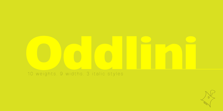
Inside my head, there are a number of forms of Sans Serif typefaces, and I cannot put aside any single one of them. Even if they were in the way of the reading process, I still think they form splendid letters. For me, when I hear for example "Sans Serif", then immediately Helvetica comes to my mind, even though I don't think that it is the best Sans Serif out there. Of course it is a great typeface, but I believe that one should not be fixated on the association of Sans Serif = Helvetica. It is just that Sans Serif goes hand in hand with Helvetica after all, and I don't think it is exaggerated to say that everyone throughout the world would agree. In my head there is no conflict about this either, and I readily agree with this thinking. However, just because of that I don't necessarily spend time studying Helvetica in detail and analyzing its subtleties in order to progress with a design. I am just clear about the fact that the mental picture of a typeface which I deem important when working on a design is a grotesque typeface like Akzidenz Grotesk. Of course I don't intend to recut it, but to reverse the way of thinking even further, and have often designed with the vague image of, for example, an old unrefined typeface in mind.

